Saucony’s Rad Ad Campaign

I love Running in Sauconys! This is definitely just a personal preference, but my feet still feel brand new when I get back from my run. Does it get better than that? Apparently it does, because their ads are just as flawless as their shoes! I created an ad that I thought would go really well in the same ad campaign.

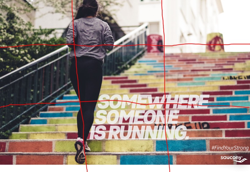
Here’s the original:

SauconysAdColor

That person running might be me. And it might be in the middle of nowhere!

I found this ad at:

https://www.google.com/url?sa=i&rct=j&q=&esrc=s&source=images&cd=&cad=rja&uact=8&ved=2ahUKEwiE2ZWo1Y7cAhXQHjQIHQ6bAz0QjRx6BAgBEAU&url=https%3A%2F%2Fbrooksrunningevaluation.wordpress.com%2F2015%2F04%2F20%2Fsynergy-driven-ad-competitors%2F&psig=AOvVaw1soUjtEFbjZ2OquwTC8v19&ust=1531110514247847

They have lots of Saucony advertisements you can find when you Google search them. I claim fair use to use this ad in my article today.

The Design

SauconyAdRepetition

The design of this article shows alignment, repetition and proximity. The alignment is evident when you imagine the rule of thirds on it. Those lines draw our focus to the woman’s face and the words on the bottom right. There is repetition in the recurring whiteness of the words, logo, lights, and shoes. The proximity is strong because you can see how even though everything is close together, none of the wording or body parts or wall fixtures overlap. They all have their own space.

The Colors

SauconyAdColor

The colors are strong and bold. This ad stands out as you are flipping through a magazine because it is dark and bright at the same time. There are dark edges showing the lateness of the hour, but the light and bright pink she is wearing make her stand out against the darkness.

The Typography

SauconyAdTypography

The Typography is genius! The main wording follows the line of the woman’s leg. It draws your eyes to the words even though they are just white. The white accents the picture well though as I mentioned before. The hashtag before “FindYourStrong” give it an edgy and modern feel.

My Ad

Ad CampaignFinal

My ad is very similar in style to Saucony’s ad. I found the same logo to use, used the same wording, and the idea that people could be running anywhere around the world. It is an encouraging thought!

The Design

Ad CampaignFinal

My design also follows the rule of thirds. I wanted a photo that would draw your attention to the runner and the typography and let your mind forget the rest of the photo until you focus on it. The wording again follows the woman’s leg, even though her leg is pointed the other direction. It doesn’t draw your eye to the words as well, but it has the same idea. There is the same repetition in the color of the wording, logo, stairs, and shoes. Proximity is strong again as you notice how well the lines from the stairs blend with the rest of the picture.

The Colors

Ad CampaignFinal

There are a lot more colors in this ad, but the main one is still the white color. You see the white in the sky, in the wording, on the shoes, on the railings, and on the stairs. The bright colors are again what would attract a magazine reader to this page. She contrasts by wearing those dark clothes. That is why it works so well!

The Typography

Ad CampaignFinal

I used all the same wording and found very similar fonts in order to match the original ad. I did move the hashtag and the logo to the side of the screen so it wouldn’t get washed out by the light colored stairs. I think it is more important to keep the color than the location.

Conclusion

Basically, these two ads motivate the same thing: run no matter where you are! You can gain that motivation by getting a decent brand of running shoes.

Thanks Saucony. ❤

Jerusalem: A Photogenic City

130 before workWashington_Post_Outlook_170604_01_resized

Introduction

Jerusalem is beautiful. I loved every minute I spent there. Chloe Coleman did a great job of editing this photo to focus on the city. Danielle Rindler designed the layout of the magazine to emulate the joy this young Israelite feels to be part of  her country. I found this article at

https://www.dvphotonet.com/blog/662017recent-publication-the-washington-post-outlook-special-issue

130 fontstylesWashington_Post_Outlook_170604_01_resized.jpg

Font Styles

“The Washington Post” is always the same decorative font. This opens up the titles of the articles and the actual writing to be any other font. In this case, the title “THE 50-YEAR WAR” is an all-caps version of an Oldstyle font, which is the same font as “OUTLOOK,” and the body paragraphs.

Oldstyle fonts all have diagonal stress and serifs on the ends of the letters. It has thickand thin stroke transitions in the middle of the letters. Normally, lower-case letters have slanted serifs, but capital letters have the straight edges.

“The Washington Post” is definitely a decorative font because it is so different from all the rest. You definitely wouldn’t want to read a whole page of that font. It isn’t in a cursive form, but is very elaborate.

These two fonts contrast because of the shape of each letter. This is actually a good thing because you don’t want your fonts to look too much alike. This when the problems really start happening. To be more specific, the serifs are different shapes, and there are decorative lines that run through the letters, giving them their special feel.

130 depthWashington_Post_Outlook_170604_01_resized.jpg

What Makes the Photo Stand Out?

As I said before, Chloe Coleman made the viewer focus on the city instead of on the girl by putting her and the flag out of focus. This is an example of depth-of-field which photographers use to force focus. The girl is still present, and obviously rejoicing in her beautiful land, but she’s almost a second thought.

This photo also uses the rule of thirds with the flag pole right on the line of the last third line. The pole gives us lines that remind the eye of the height and stature of the girl. Roads throughout the photo remind us to look at the girl and the flag, even though they are out of focus. These are called leading lines.

My Photos

I have a similar love of Jerusalem as this girl. I have taken and been in photos that emulate the same rejoicing. These were taken by me, or modeled by me.

25348765_1621208177940191_5545006757802750919_n.jpg

This girl is showing her love for the flag of Israel, just like the girl in the original post. It uses the rule of thirds, and has all the people walking down the hill toward her.

26114100_1634334213294254_269694917863733461_n.jpg

All of the leading lines in this photo point straight to the girl sitting on the wall. Although this photo doesn’t quite use rule of thirds vertically (unless her knees are the focal point), the lines of the walls are right on the rule of thirds horizontally. This picture also looks over the old city of Jerusalem, similar to where the original girl is standing.

26111965_1634337539960588_1028554076862208282_n.jpg

This last girl uses rule of thirds almost perfectly. The attention is all drawn to her, and you can see her giant bear-hug of the city. The fog over the city puts it a little bit out of focus, and helps us know where to look. She, too, is looking at the city, just like the girl in the picture.

Conclusion

Any of these pictures could have replaced that original photo to show the same love for Jerusalem. They also utilize many of the same photography principles such as rule of thirds, leading lines, and depth-of-field. The fonts used in the original magazine all work together really well to create interest in each of the different headings. They make you want to continue reading in order to see what the paragraph is about.

Wendy’s: Advertisement Game is Strong

Wendy's Ad
Everyone loves Wendy’s.

Introduction:

“Double beef. Double cheese. Doubly amazing.” Now, that’s a way to get people to buy a burger! Just look at how juicy and delicious that double cheese burger is. I would say it looks good enough to eat to say the least. Wendy’s was founded by Dave Thomas in 1969 in Ohio. He was adopted as a kid, so he also started The Dave Thomas Foundation which raises money for foster kids to find forever homes (wendy’s.com).

Wendy’s ads are full of enticing things. Not only is their food delicious, but their ads use good alignment, color, contrast, proximity and alignment to capture your eye.

Alignment:

Wendy's add showing alignment.

The text is all flush left in this advertisement. This shows strength, which helps the reader understand where to start reading, and where to stop. The burger is tall, creating vertical lines that match the main paragraph. These vertical lines are matched by the lines on the container for the “Savory Signature Sauce,” and the one line on the top bun that wants to fit in with the rest. There are many horizontal lines because of all the layers of the burger. Even the signs above the burger are tilted, which create the illusion that they are following the curvature of the burger bun.

Color:

Wendy's ad showing matching colors.

This picture might look confusing, so let me explain it before you move on. Each matching circle represents a color that was repeated. As it turns out, all the colors used on this ad were used more than once. There is no lonely color. Black circles the repeated color white, while green circles red. Get it? Wendy’s main color is red. Their letters are red, their back ground is red, and they use a very red tomato to help the burger fit in the picture. Even the bun and “Savory Signature Sauce” match the vertical line in the back of the picture. See for yourself the colors used to create unity in the advertisement.

Contrast:

Wendy's ad showing contrast.

The contrast of the white-on-red makes the words hard to miss. Having the burger against the background signs makes the burger pop out of the picture! This use of contrast helps the burger be the main focal point. The purple onion and green lettuce contrast with the rest of the picture, but they, too, help the burger look delicious and stand out from the rest of the page.

Proximity:

Wendy's ad helping explain proximity.

The proximity of this ad is interesting because the picture portion is all overlapping. However, this just creates the visual aid to help you notice words better. “Doubly Amazing” is the same distance to the picture as the “Learn More” button is. I noticed that the “Learn More” button is not aligned with the words above it, and this is why: It is the same distance away from the picture to create a unified look throughout the page. You will also notice that the designer was concerned with the first four words ending in a line, so the font sizes are all different. This creates an equidistant proximity from all four words to the image as well.

Repetition:

Wendy's ad showing repetition

There are many things repeated in this ad, but two of them are font and color. There are only two fonts on the whole page: one a scratchy handwriting, and the other an all-caps bold face. These contrast each other, and help make a point of the important things to read. The colors most frequently repeated are red and yellow, which are “primary colors.” They help make a bold impression, just like Wendy’s always tries to do.

Conclusion:

Thanks to the alignment, color, contrast, proximity, and repetition of this ad, it stands out. We are drawn to eat at Wendy’s and try their new, delicious-looking burger. Because of its construction, this is an effective ad.