

Introduction
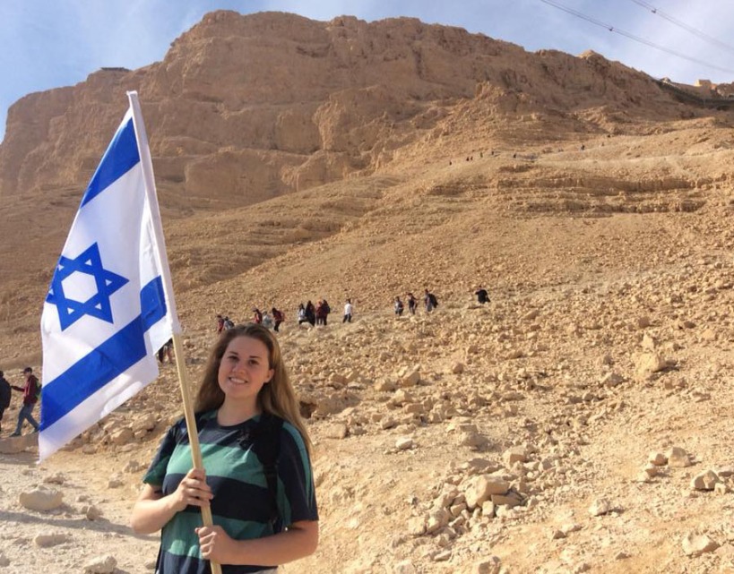
Jerusalem is beautiful. I loved every minute I spent there. Chloe Coleman did a great job of editing this photo to focus on the city. Danielle Rindler designed the layout of the magazine to emulate the joy this young Israelite feels to be part of her country. I found this article at
https://www.dvphotonet.com/blog/662017recent-publication-the-washington-post-outlook-special-issue

Font Styles
“The Washington Post” is always the same decorative font. This opens up the titles of the articles and the actual writing to be any other font. In this case, the title “THE 50-YEAR WAR” is an all-caps version of an Oldstyle font, which is the same font as “OUTLOOK,” and the body paragraphs.
Oldstyle fonts all have diagonal stress and serifs on the ends of the letters. It has thickand thin stroke transitions in the middle of the letters. Normally, lower-case letters have slanted serifs, but capital letters have the straight edges.
“The Washington Post” is definitely a decorative font because it is so different from all the rest. You definitely wouldn’t want to read a whole page of that font. It isn’t in a cursive form, but is very elaborate.
These two fonts contrast because of the shape of each letter. This is actually a good thing because you don’t want your fonts to look too much alike. This when the problems really start happening. To be more specific, the serifs are different shapes, and there are decorative lines that run through the letters, giving them their special feel.

What Makes the Photo Stand Out?
As I said before, Chloe Coleman made the viewer focus on the city instead of on the girl by putting her and the flag out of focus. This is an example of depth-of-field which photographers use to force focus. The girl is still present, and obviously rejoicing in her beautiful land, but she’s almost a second thought.
This photo also uses the rule of thirds with the flag pole right on the line of the last third line. The pole gives us lines that remind the eye of the height and stature of the girl. Roads throughout the photo remind us to look at the girl and the flag, even though they are out of focus. These are called leading lines.
My Photos
I have a similar love of Jerusalem as this girl. I have taken and been in photos that emulate the same rejoicing. These were taken by me, or modeled by me.
This girl is showing her love for the flag of Israel, just like the girl in the original post. It uses the rule of thirds, and has all the people walking down the hill toward her.

All of the leading lines in this photo point straight to the girl sitting on the wall. Although this photo doesn’t quite use rule of thirds vertically (unless her knees are the focal point), the lines of the walls are right on the rule of thirds horizontally. This picture also looks over the old city of Jerusalem, similar to where the original girl is standing.

This last girl uses rule of thirds almost perfectly. The attention is all drawn to her, and you can see her giant bear-hug of the city. The fog over the city puts it a little bit out of focus, and helps us know where to look. She, too, is looking at the city, just like the girl in the picture.
Conclusion
Any of these pictures could have replaced that original photo to show the same love for Jerusalem. They also utilize many of the same photography principles such as rule of thirds, leading lines, and depth-of-field. The fonts used in the original magazine all work together really well to create interest in each of the different headings. They make you want to continue reading in order to see what the paragraph is about.
